Dixon
Identity Update / Packaging / Custom Pattern Design / 3D Packaging Rendering / 3D Product Rendering
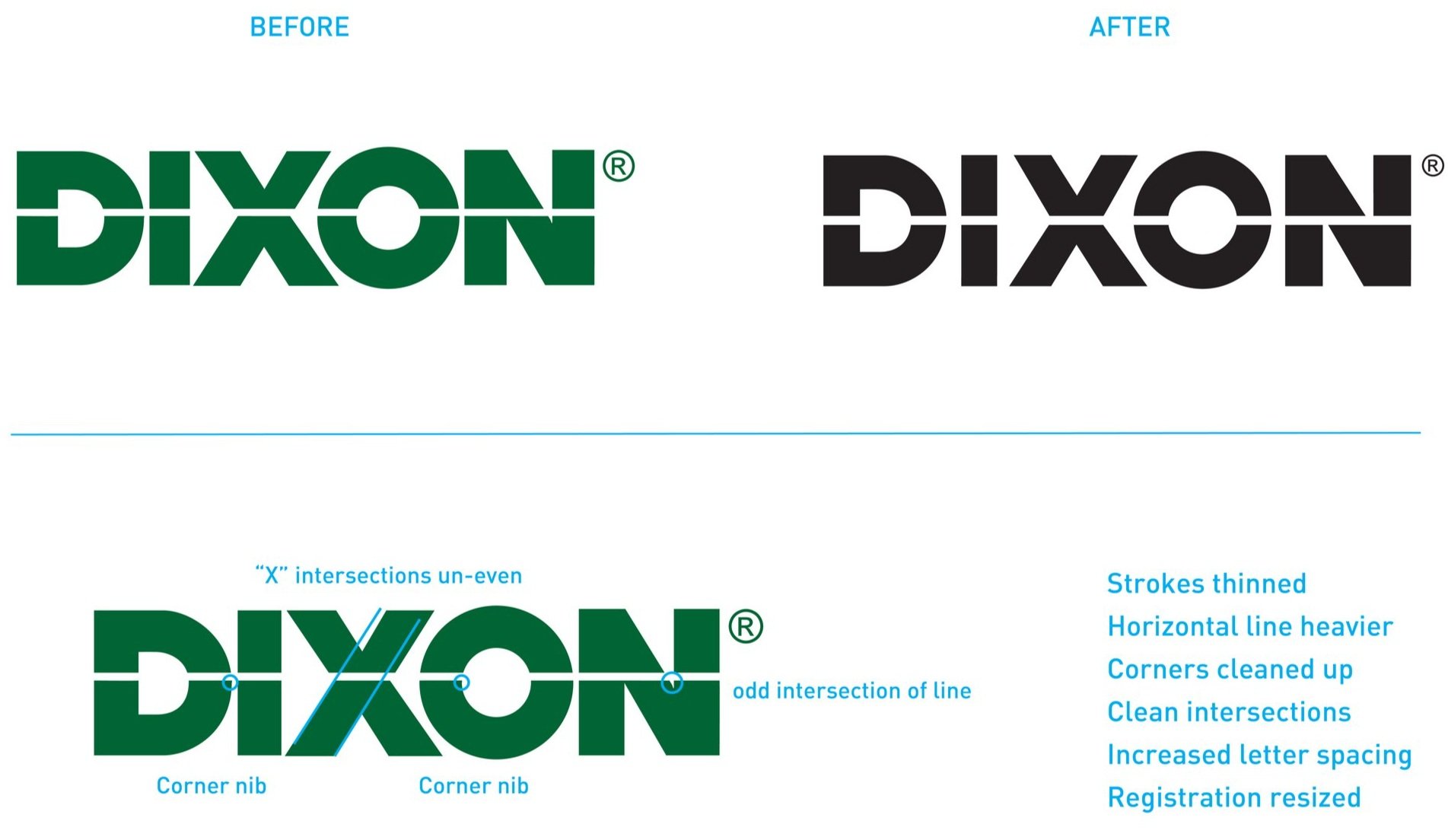
In 1827, Joseph Dixon manufactured the first wood and graphite pencil in the country. Today, Dixon offers a full array of products for schools, offices and industrial applications. We partnered with Dixon on a bold brand update and packaging redesign that stands out in the digital retail environment and modernizes this pencil pioneer. A refreshing update to the identity, a new color palette that would pop on the e-commerce shelf and custom pattern design helps to differentiate Dixon’s various product offerings in the office supplies category.
Package ReDesign
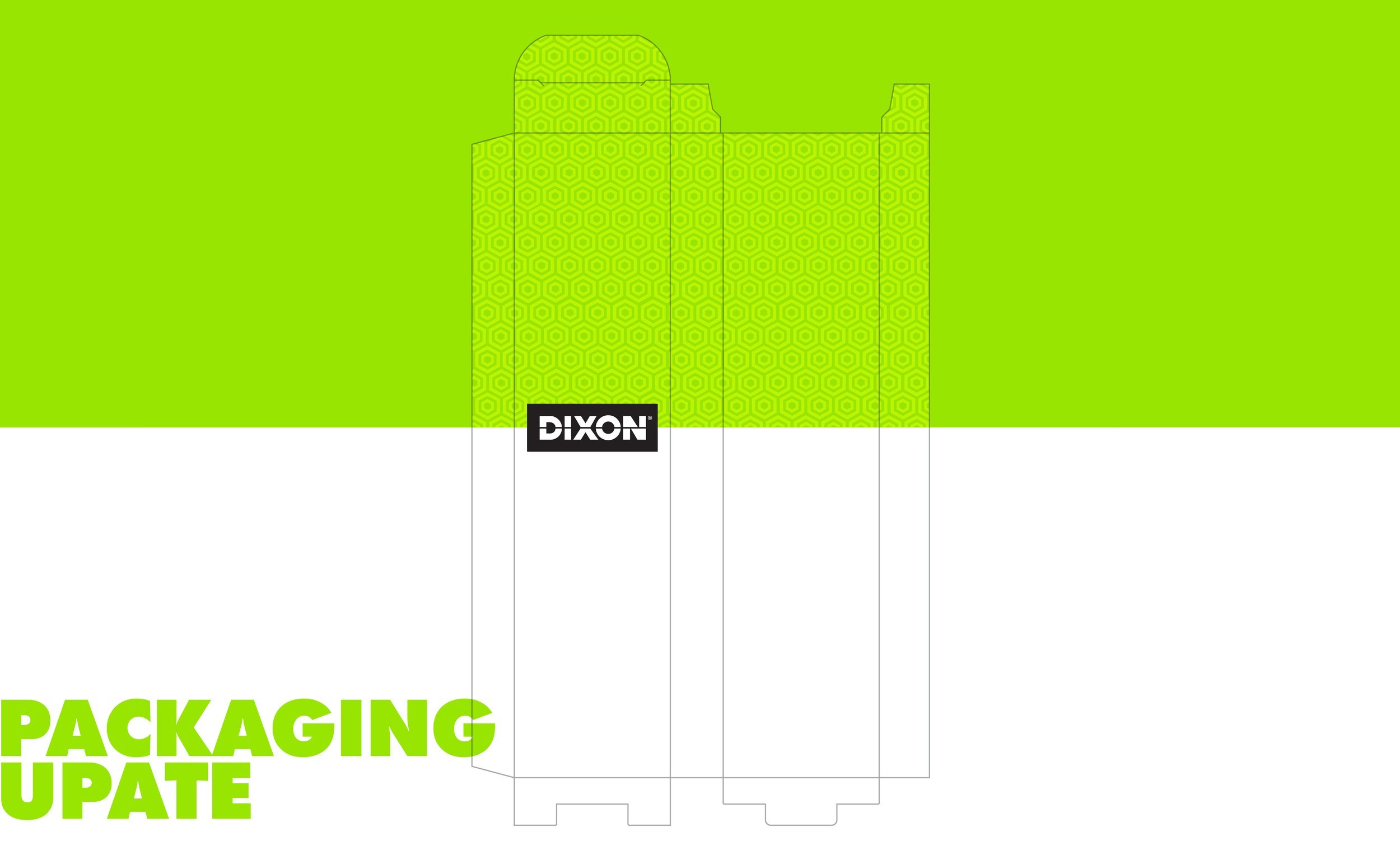
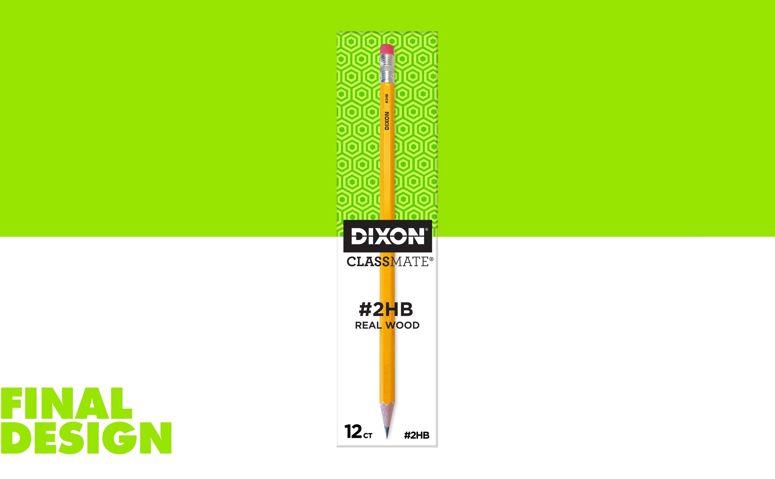
Dixon pencils have a long history of being widely used in schools across the country and being the go-to brand for test taking. Known for quality and affordability, the new package needed to be approachable but vibrant while also leveraging the equity of the well-known Dixon brand. This simple yet bold design brings the brand—and the product—front and center, while a pop of bright green grabs attention on the shelf both online and in-store. The new design was applied to various category skews across the Dixon product portfolio.
Identity Update
With the logo at the center of the packaging rebrand, refreshing the Dixon identity was vital. A series of small changes to the original word-mark resulted in a clean, crisp update that keeps the original integrity and equity of the brand. The dividing line that was present in the original word mark inspired the divided color block on the new packaging. Containing the reversed word-mark in black demands attention and further pumps up the boldness of the rebrand.
Custom Pattern Design
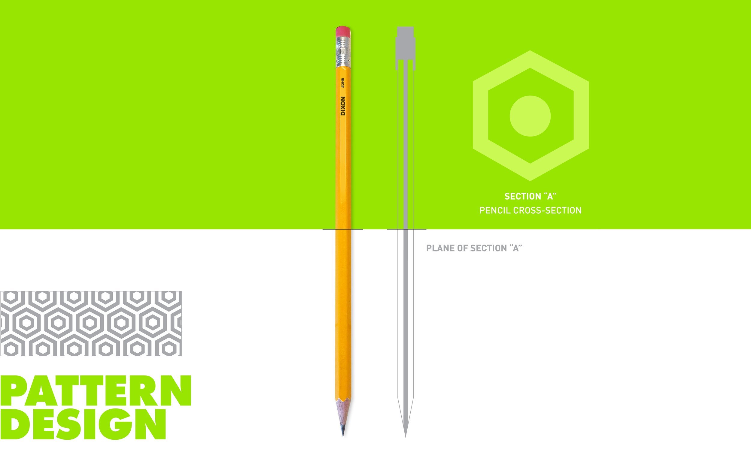
Knowing that the rebrand would span across several office product categories, we designed custom patterns to be used with everything from pencils to rubber bands and beyond. We took inspiration from the products themselves to create these fun and distinct graphics.


