Rust-Oleum
Product Naming / Identity Development / Packaging Design / Packaging Graphics / 3D Packaging Rendering
For the professional contractor and the DIY weekend warrior, efficacy & dependability are top priorities. These priorities motivated our Design. Rust-Oleum partnered with PXL Graphics to rebrand several lines of aerosol products. We initially focused on an aerosol based flexible coating product and then quickly moved onto a private label retail brand of spray paints. While partnering on these retail aerosol projects, we were then asked to name and develop an innovative product, for the Professional Rust-Oluem portfolio.
Leak Seal Packaging
Rust-Oleum requested a rebrand of Leak Seal that would be modern on shelves and suggest the waterproof and flexible nature of the product. We began with an identity exploration that then inspired the custom graphics and product illustration which suggest its flexibility, efficacy and waterproofing qualities.
Our involvement included:
Leak Seal identity
Labeling graphics
Product illustration
Color coding system
Structural packaging update
Identity Development
The logo was designed to reinforce the benefits and qualities of the product, which is a flexible, waterproof barrier that is sprayed onto a surface. The letter “A” takes on a water droplet shape while the crossbar below represents the waterproof barrier.
Leak Seal brand moodboard
Pro Series: MegaMark
Product Identity / Brand Series Identity / Label Graphics / Color Coding System / Structural Packaging Concept
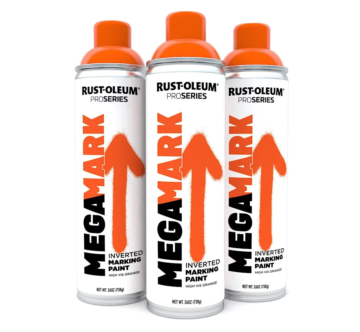
This innovative mega-sized inverted spray paint can from Rust-oleum needed a name. After a naming exercise, we began to develop word marks around a few favorites. MegaMark was suggested for it’s oversized personality and double meaning. Knowing that the can sprays while inverted, we ran the identity sideways on packaging which accentuates the height and size of the product. A spray painted arrow accompanies the logo and strongly suggests the inverted use. In addition to MegaMark, we also suggested to the team to shorten the category name of PROFESSIONAL to ProSeries for an updated aesthetic and modern naming convention. The result is a larger than life presence on the retail shelf.
Inspiration & Development
Design started with the user experience of the product. Our research led us to a deeper understanding of the users environment, the application of the product and other elements that then provided inspiration for the design and brand development.
MegaMark brand moodboard


